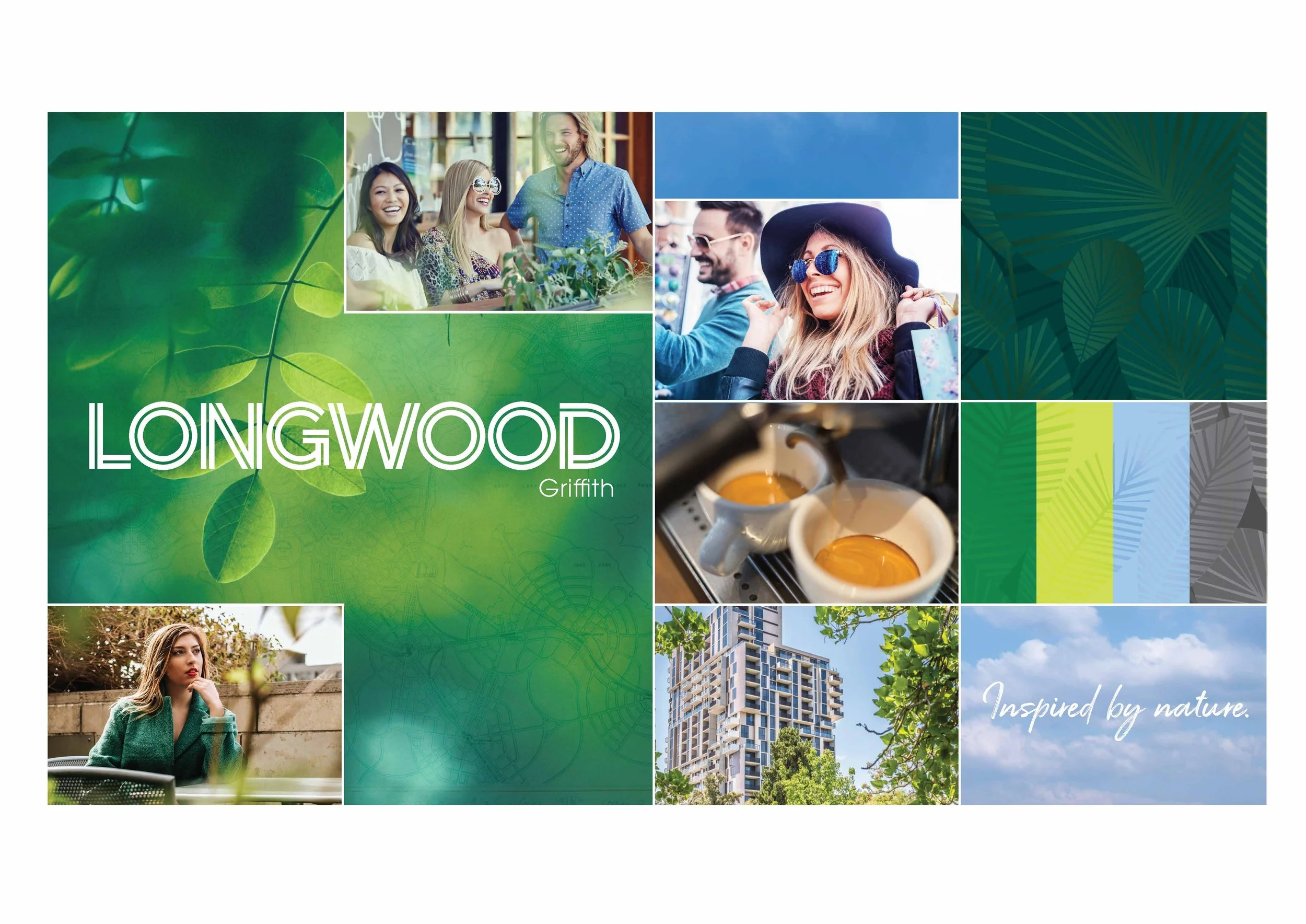
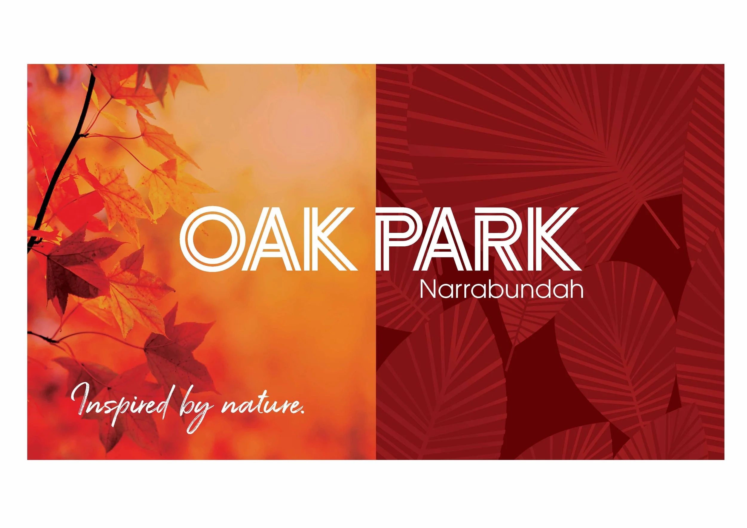
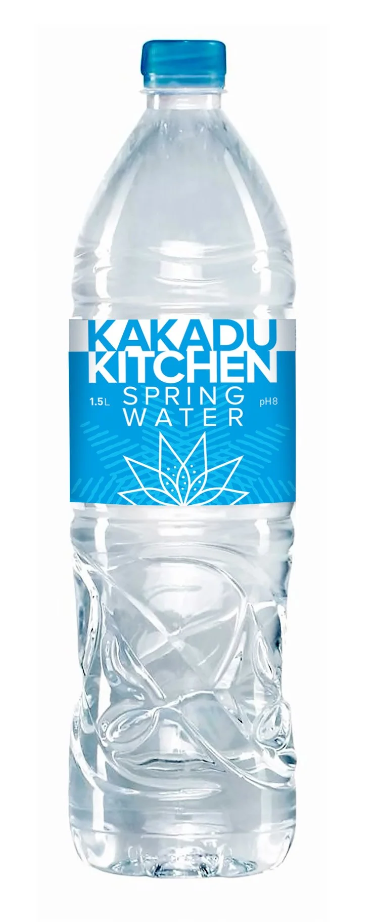
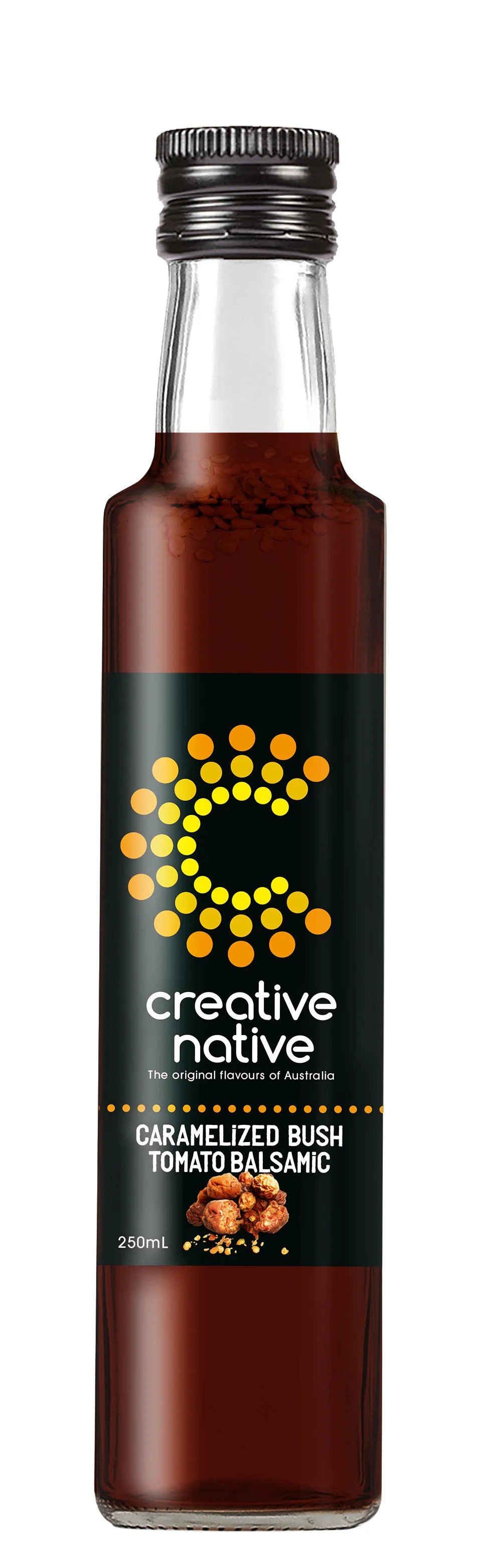
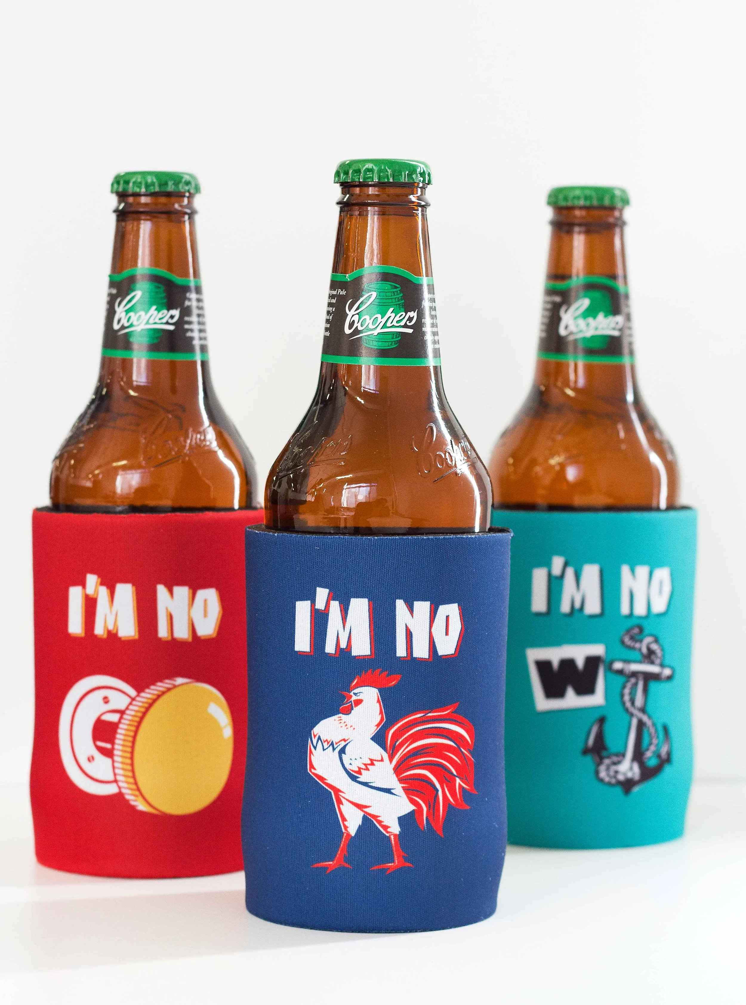
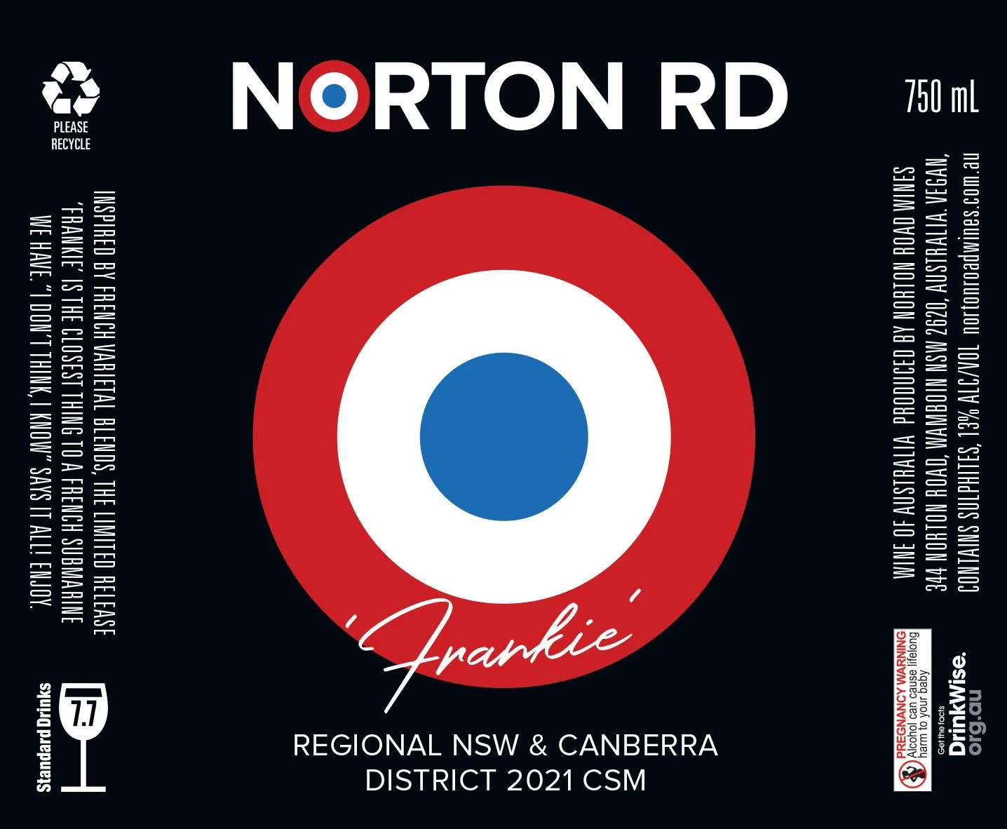
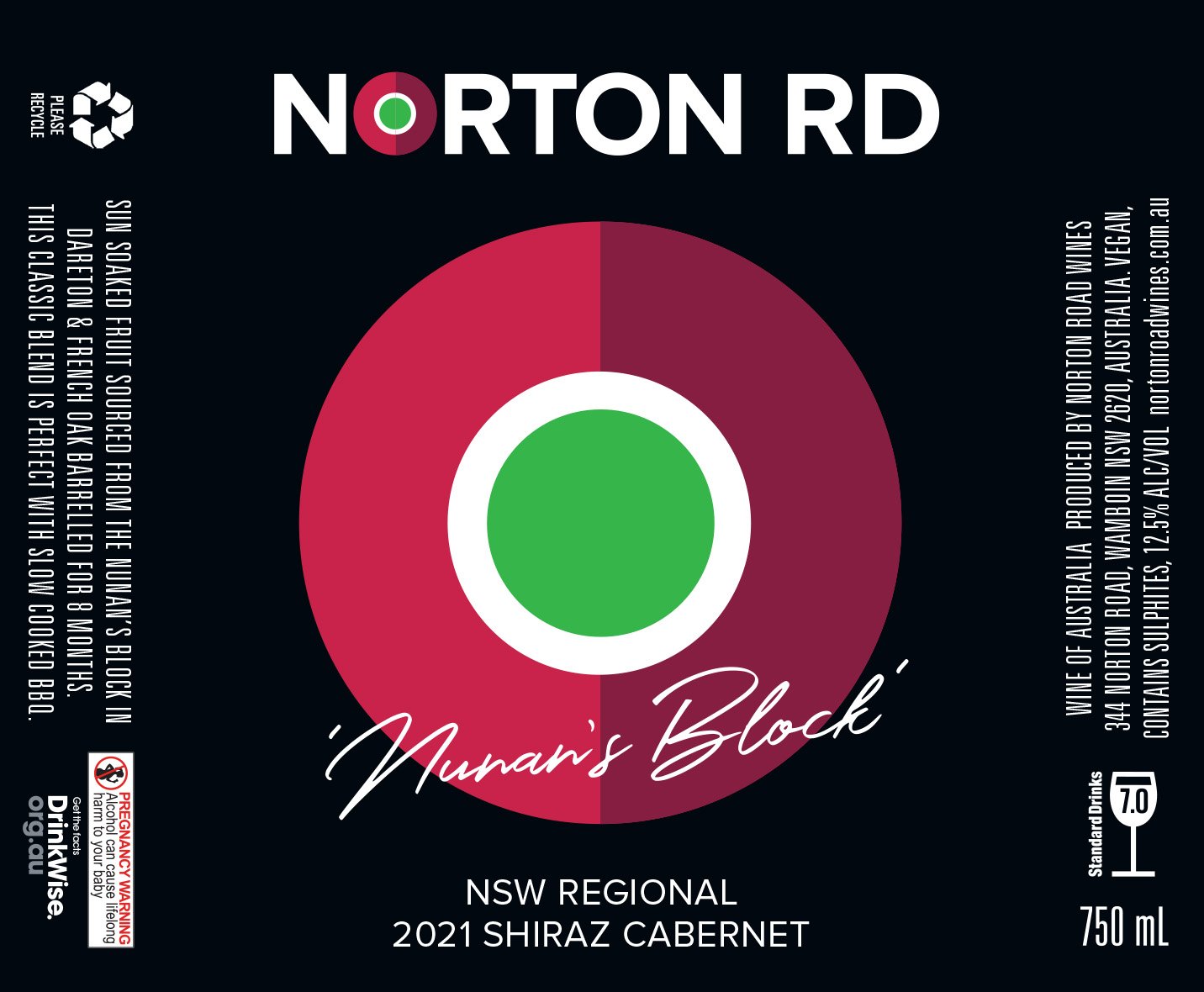
This was conceptual design for a redevelopment with a focus on the green surrounds.
In contrast, Oakpark features old Oak trees and a warm, wood feel provided a contrast with neighbouring Longwood.
Foodland pride themselves on their ‘home’ brands - sourcing everything from quality South Australian producers. This is part of the rebrand of this range.
The Foodland Private Label range called for ‘premiumisation’ as well as clear colour differentiation across each category and consistent branding.
‘Before and after’ label
Olive Oil bottle ‘dummy’ to test shelf presence in store.
’Before and after’ label
Another bottle mock-up for testing.
Zamel’s needed a fresh, contemporary look for their packaging - shifting from a rather staid burgundy box to something with a bit of ‘sparkle’.
Retail promos need to be eye-catching, but can still be feminine.
Appealing to the fashion conscious woman.
When you need to shout - do it with style!
A small cellar door and restaurant in regional NSW needed to stand out from the crowd.
The Norton Road ‘roundel’ logo provides a lot of flexibility - in this instance used to promote ‘Valentine’s Day’.
This time the roundel has transformed to celebrate ‘St Patrick’s Day’.
A simple Trade Show promo display - visualised to communicate the concept to client.
“Everyone calls me Straatts. After 30 years as an Art Director in this industry, it’s a nickname that everyone seems pretty comfortable with, and I like that.” - Paul Stratton.